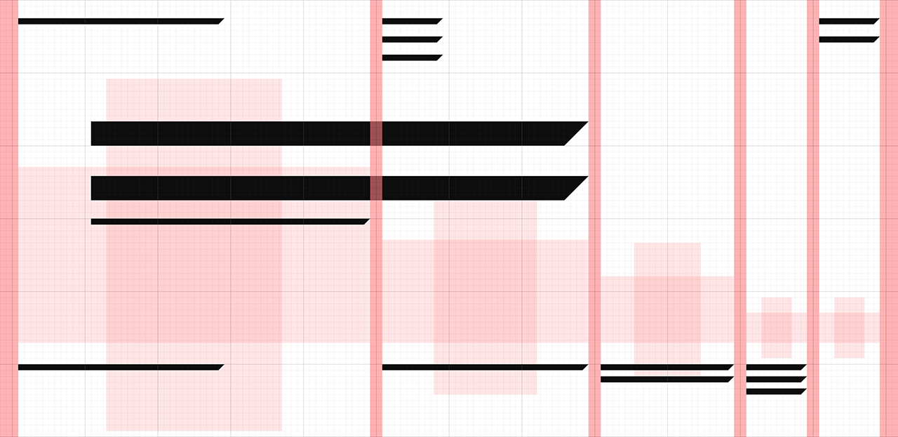
Experiment with a modular grid based on Fibonacci sequence, 2017. I wanted to show that classic mathematical proportions can serve as a basis for flexible mechanism for displaying content on the web. The sum of the first numbers of this sequence happened to be 12 (1+1+2+3+5=12), a common number of columns in most popular frameworks. Using this as a starting point for the grid, I've decided to show how text and images can be placed on the page. I've selected a gallery website structure with several authors, a Catalog and some other pages like Sign up and About.
*All images from Coup agency, Oslo, are used for project dummy content only.
Modular grid, based on Fibonacci sequence:
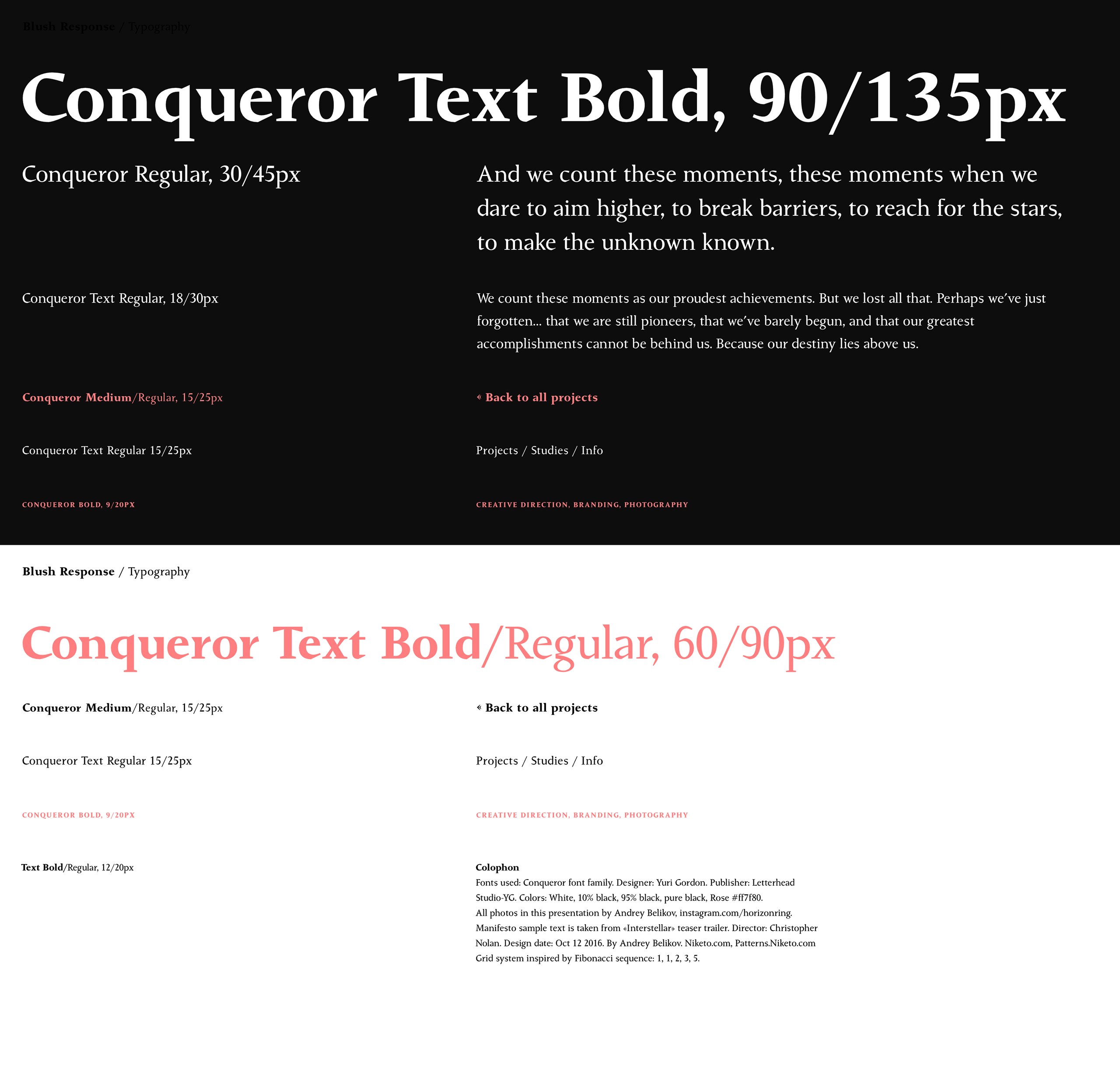
Typography:
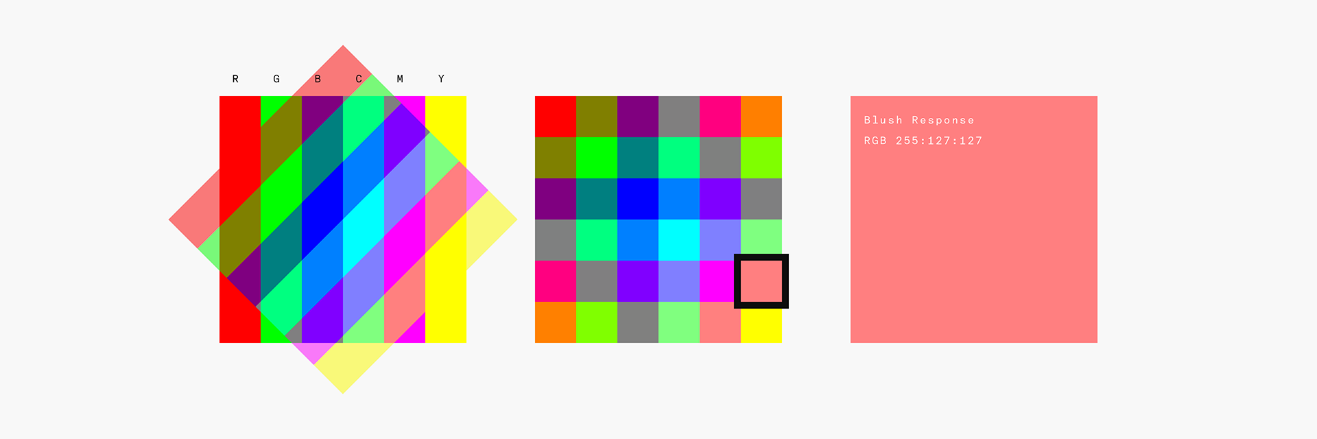
Color scheme based on the "Blush" color, generated from basic RGB and CMYK colors:
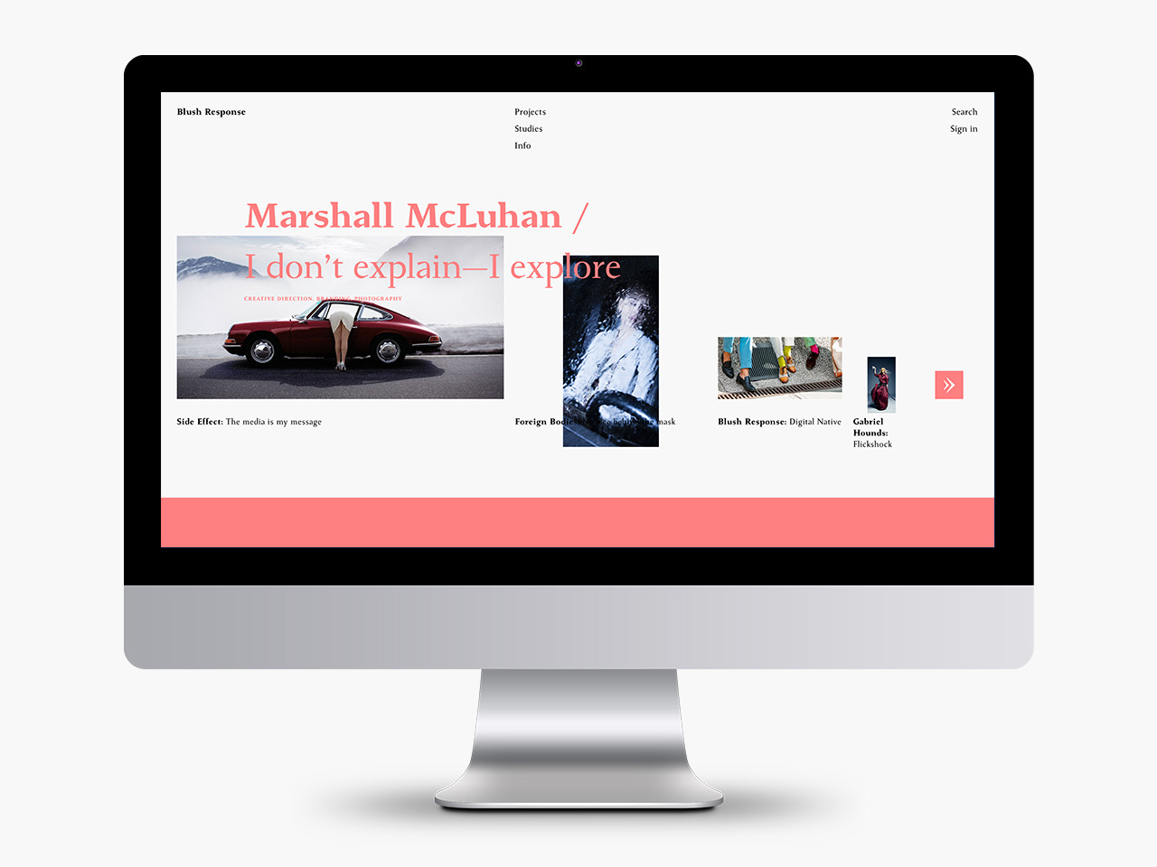
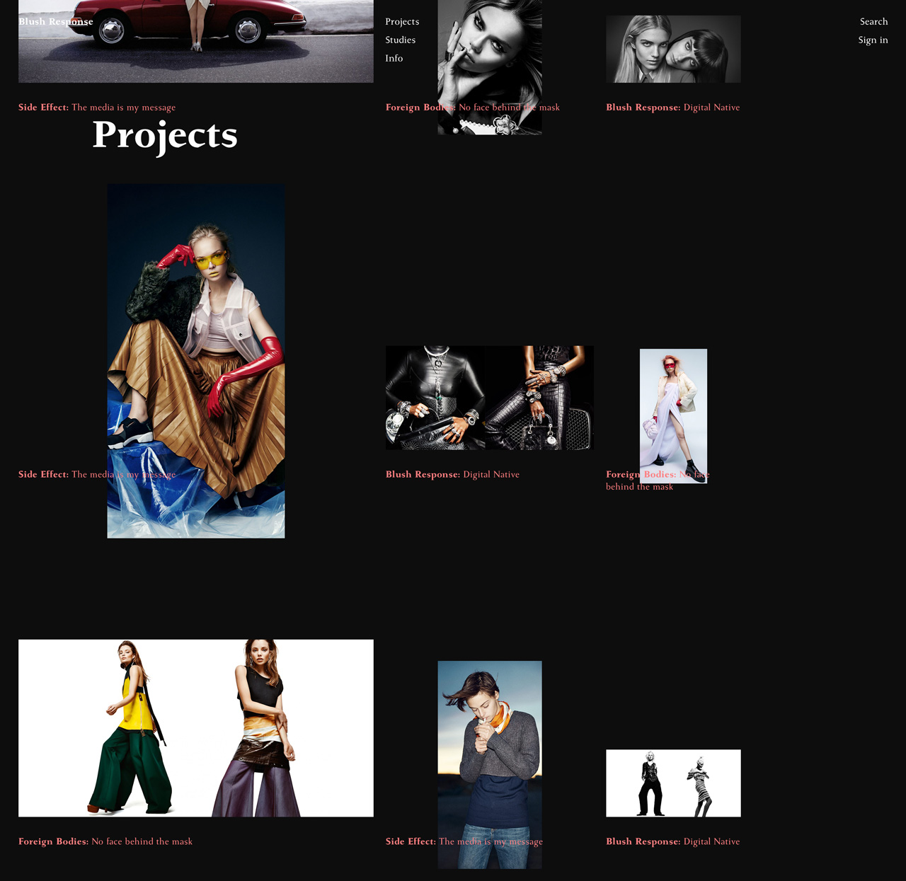
Projects page shows personal projects by all agency photographers:
Photographers index:
Full screen slideshow:
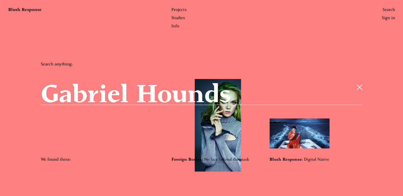
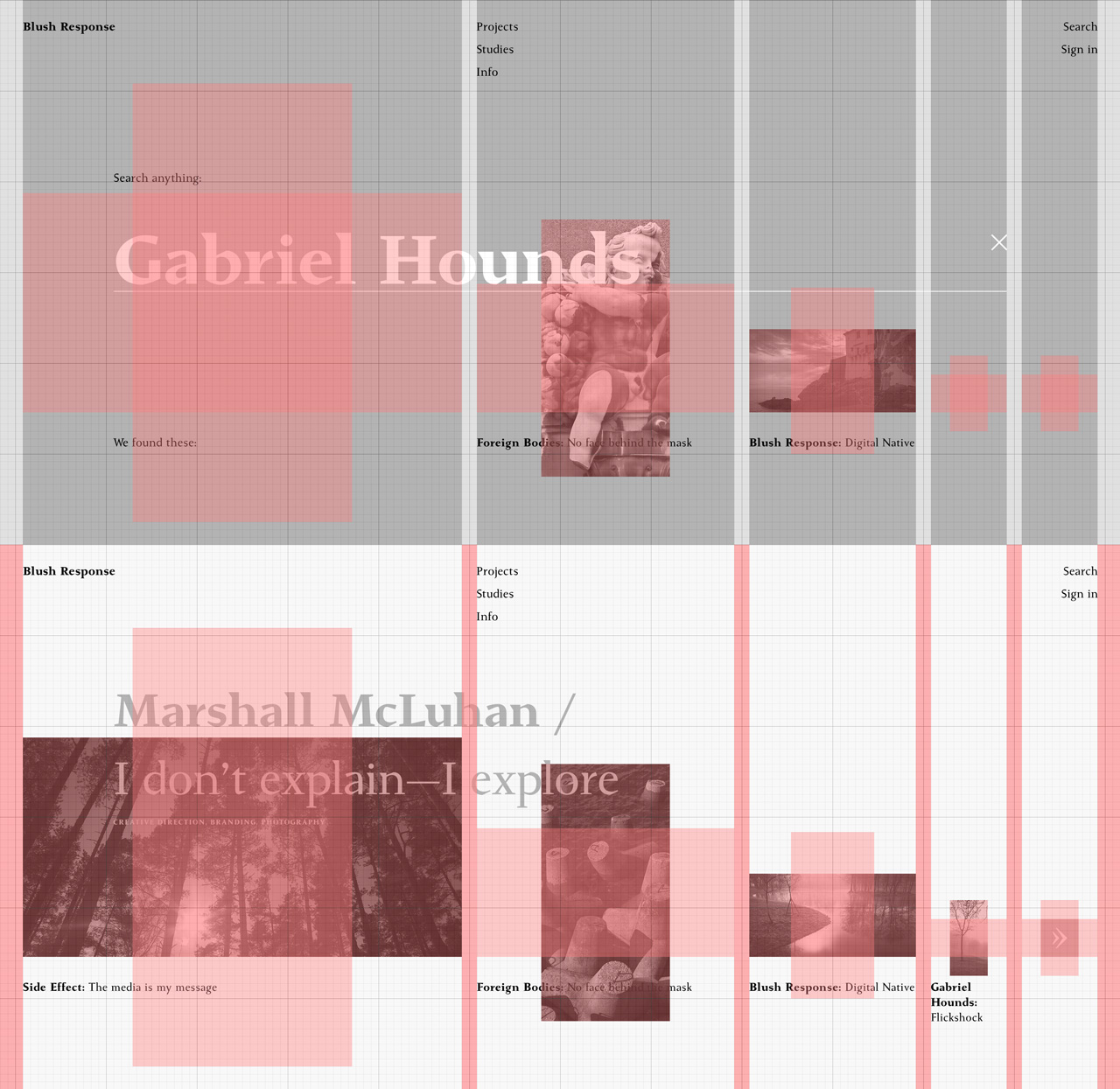
Search results:
How 2x1 images fit the grid:
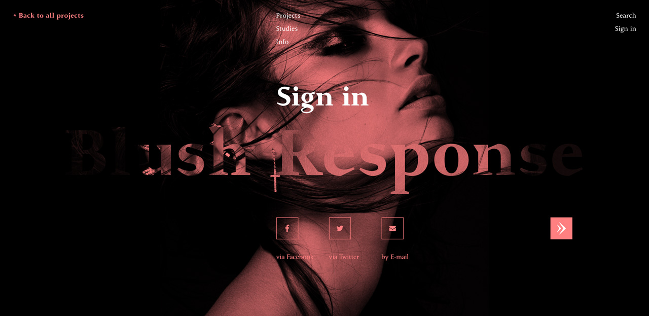
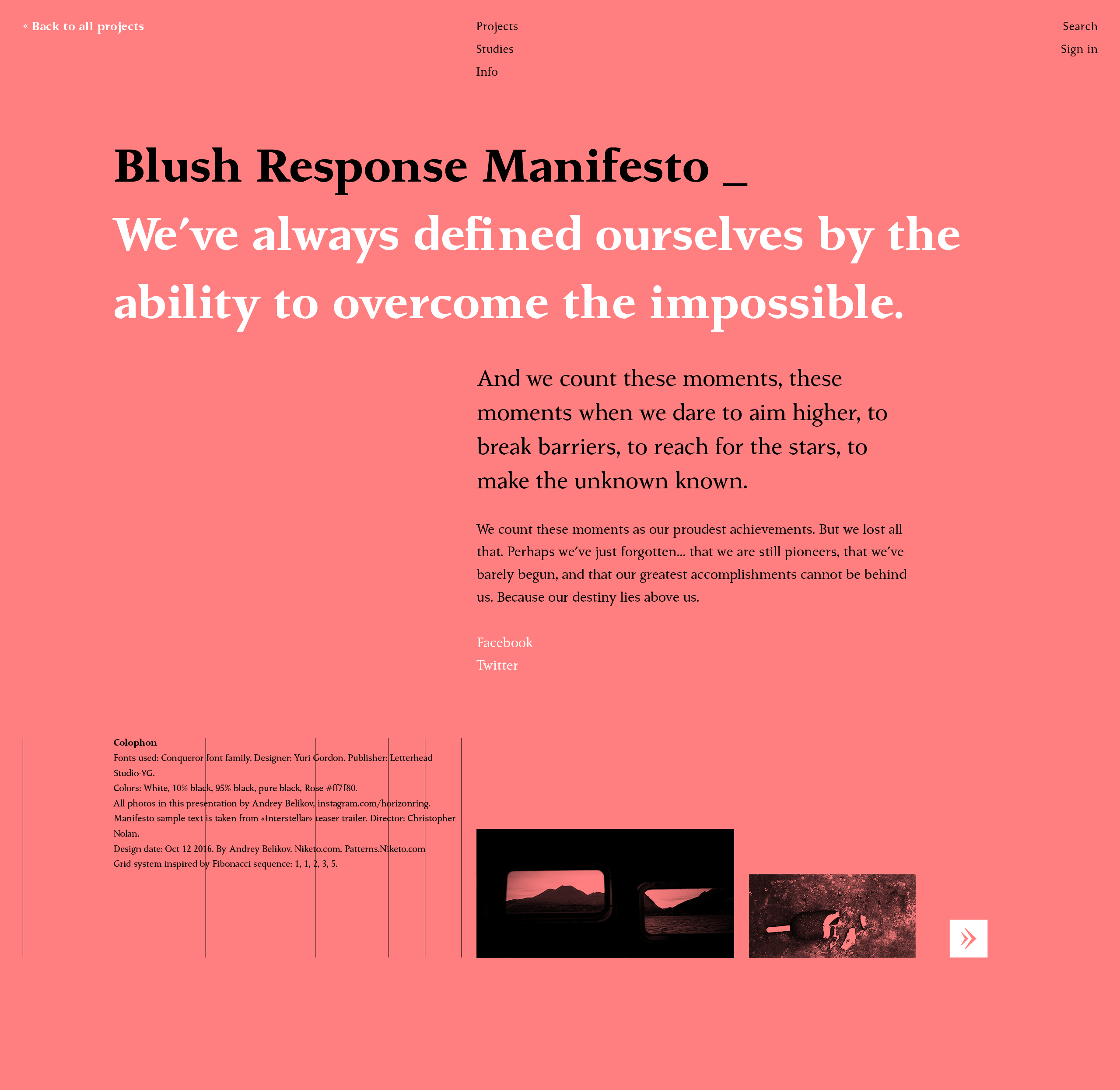
Agency Manifesto:
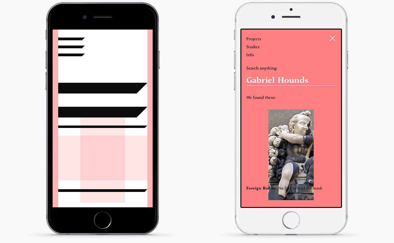
On mobile Fibonacci grid shrinks in just one column:
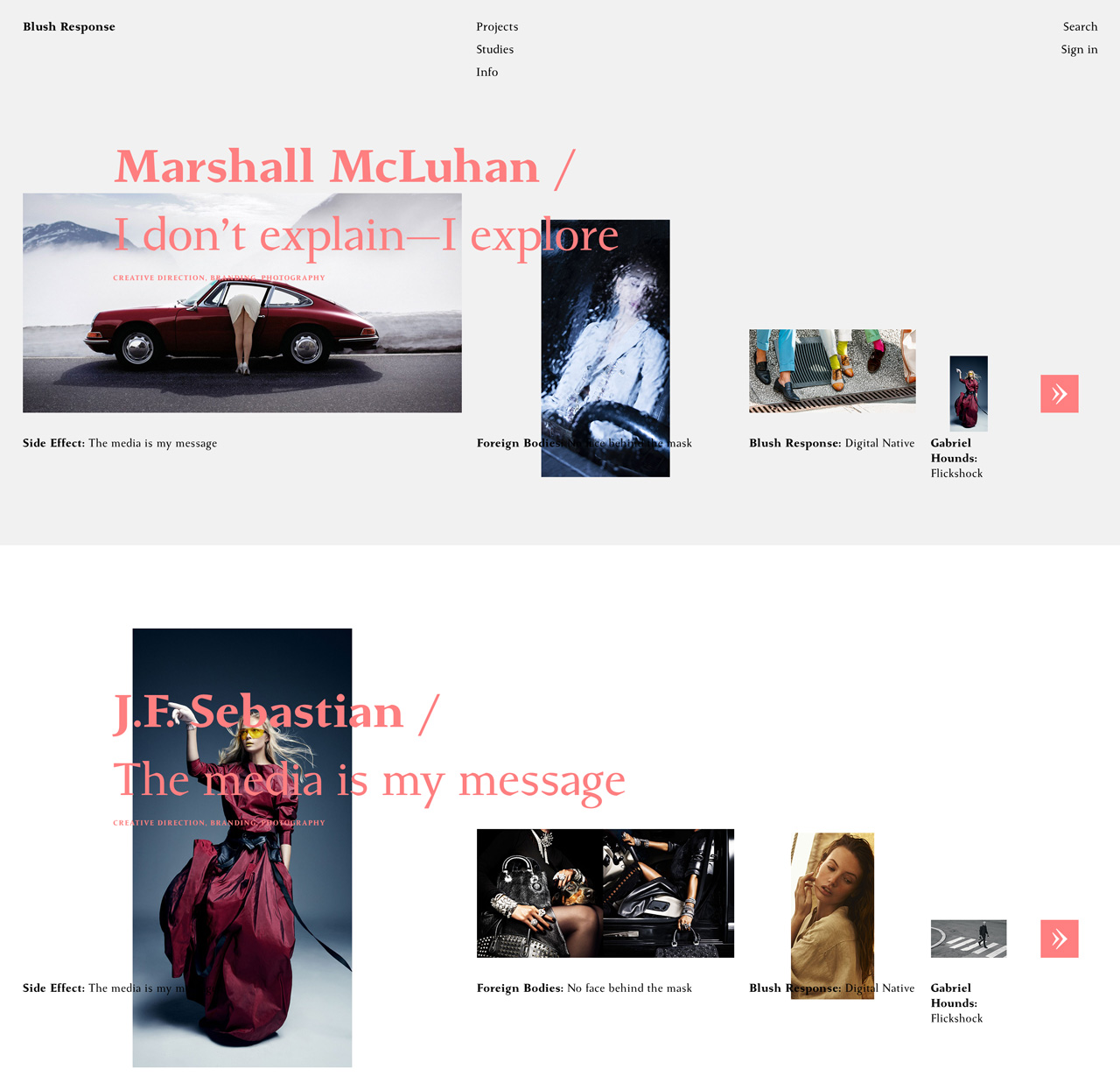
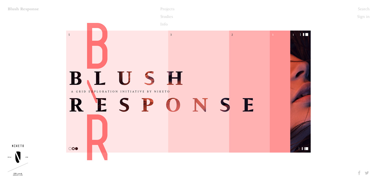
Main page: